How to Choose Art for a Room: A Simple Guide
Choosing art for a room can feel like a big decision. It is one of the few things in a home that you look at every single day, and the right piece changes how a whole space feels. The good news is that a few simple steps take most of the guesswork out of it: think about the mood you want, get the size right, pick up colours already in the room, and consider the light.
This guide walks through each step, then looks at what works best room by room.
1. Start with how you want the room to feel
Before you think about colour or size, ask what the room is for. A living room is for gathering and talking, so it can take a bold statement piece. A bedroom is for rest, so calmer colours and softer movement usually work better. A hallway is where you pass through, so it suits something that catches the eye at a glance.
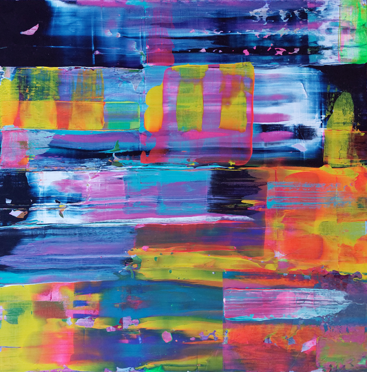
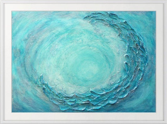
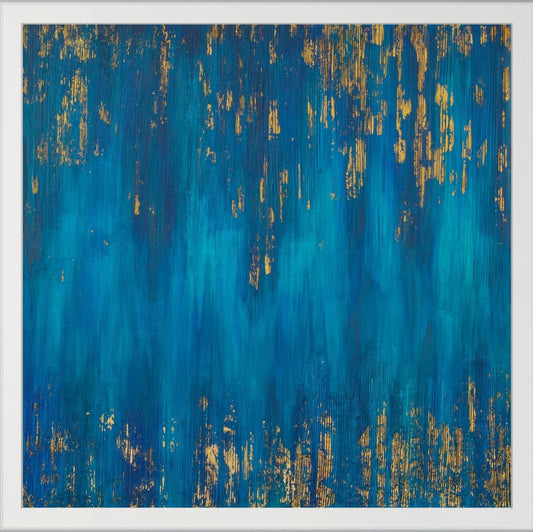
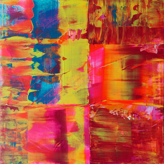
Abstract art is especially good here, because it works on mood rather than subject. Flowing blues and greens bring a sense of calm and space. Warm golds and coppers feel cosy and rich. Bright, layered colour adds energy.
2. Get the size right
The most common mistake is art that is too small for its wall. A few simple guidelines help:
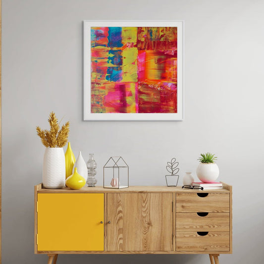
- Above furniture such as a sofa, bed or sideboard, aim for artwork that is 60 to 75% of the furniture's width. For a 200 cm sofa, that is about 120 to 150 cm of art. Our guide to what size artwork to hang above your sofa has the full sizes in cm.
- On an empty wall, a single piece should fill a good part of the space rather than float in the middle of it. If one piece would need to be very large, a pair or a small group of works can fill the space instead.
- Hang it at eye level. Galleries hang art so the centre sits about 145 to 150 cm from the floor. Above furniture, leave a gap of roughly 20 to 30 cm between the top of the furniture and the bottom of the frame.
A quick trick: cut paper or use painter's tape to mark out the size on your wall and live with it for a day. It is the easiest way to see whether a size feels right.
3. Pick up colours already in the room
Art does not need to match your cushions exactly, but it looks best when it shares at least one colour with the room. Look at your rug, curtains, a favourite chair or even the view from the window, and choose a piece that repeats one of those colours.
If your room is mostly neutral, art is your chance to add colour. A painting with deep blues or a touch of gold will give a calm grey or white room a focal point without making it busy.
4. Think about the light
Light changes how art looks through the day. Textured paintings come alive with light from the side, as the ridges and layers throw small shadows. Metallic leaf glows in warm evening light and looks cooler and brighter in the morning.
Before you choose, notice where the light comes from in the room. For original paintings, avoid walls that get strong direct sunlight for long periods, as it can fade colours over time.
5. One statement piece or a gallery wall?
A single large painting is calm and confident. It gives the eye one place to rest and suits clean, modern rooms. A gallery wall is more personal and relaxed, and lets you mix sizes and build a collection over time.
If you like the gallery wall look but don't want to plan it from scratch, ready matched limited edition print sets take care of the colours and spacing for you.
Choosing art room by room
Living room
The living room is usually the place for your biggest piece. Hang it above the sofa or fireplace, where it will be seen from the whole room. Large textured paintings work especially well here, as they hold their own from across the room and reward a closer look.
Bedroom
Choose art that helps you switch off: softer colours, gentle movement and nothing too busy. Above the bed is the natural spot. For more ideas, read how to choose art for your bedroom.
Kitchen and dining room
These are social spaces, so they can take brighter colour and more energy. Keep originals away from direct heat and steam, and leave a little more room around art near a cooker or sink.
Hallway and stairs
Hallways are often narrow, so you see the art up close. A vertical piece or a short row of smaller works suits these spaces well, and it is a lovely way to greet guests as they arrive.
Home office
Choose something that helps you focus or gives your eyes a rest from the screen. Many people find blues and greens calming in a workspace.
Original painting or limited edition print?
An original painting is one of a kind, with real texture you can see and touch. A limited edition print is a more affordable way to own a piece of an artist's work, and because only a set number are ever made, it has a rarity that open edition posters don't. You can read more in what are limited edition prints and why collectors value them.
Many people start with a print and add an original later. Both can sit happily side by side on the same wall.
Final thoughts
The best art for a room is the piece you keep noticing. Use size, colour and light as a guide, but trust your first reaction: if a painting makes you stop and look, it will almost always find its place.
If you are still unsure, I am happy to help. Send me a photo of your room and its size and I will suggest a few pieces that would suit it, or we can talk about a commission made just for your space.
Find the right piece for your room
Original paintings and limited edition prints, hand signed by Julie, with free tracked shipping worldwide.